Five years ago, I wrote a Monday Musings on book design, in which I featured three book designers. I’ve mentioned book design occasionally since then but, having just seen the shortlist for this year’s ABDA (Australian Book Design Awards) which are sponsored by the ABDA (the Australian Book Designers Association), I’ve decided to write another post on this aspect of the thing we love – books!
ABDA describes the awards as celebrating “the bravest and brightest, the most original and beautiful books published in Australia each year”. This year’s awards are the 65th! 65 years of celebrating book design! That’s wonderful, really. They make awards in sixteen categories, including four awards in Children’s and YA categories, and awards for specialist areas like Cookbooks, Fully-illustrated books, and Educational books.
I couldn’t possibly list all these, but if you are interested you can find them at the link I gave in the first paragraph. I will just focus on two categories, Literary Fiction and Non-fiction:
 Literary Fiction
- George Orwell’s 1984 (Text): WH Chong
- Ellen van Neerven’s Comfort food (University of Queensland Press): Josh Durham (Design by Committee)
- Melissa Ashley’s The birdman’s wife (Affirm Press): Christa Moffit
- Heather Rose’s The museum of modern love (Allen & Unwin): Sandy Cull (GoGo Gingko)
 Non-fiction
- Ashleigh Wilson’s Brett Whiteley: Art, life and the other thing (Text): WH Chong
- Damon Young’s The art of reading (Melbourne University Press): Mary Callahan
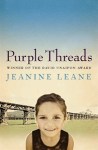
- Maxine Beneba Clarke’s The hate race (Hachette Australia) (my review): Allison Colpoys
- Andrew Hankinson’s You could do something amazing with your life (Scribe): Jenny Grigg
I’m impressed by the number of smaller publishers here. Seems they support good design too, and carefully “curate” the whole work. Certainly Melissa Ashley seems to think so …
 Melissa Ashley, author of the shortlisted The birdman’s wife, has posted on her blog about the shortlisting of her book’s cover. The novel, historical fiction, is about Elizabeth Gould the wife and accomplice of the famous ornithologist and artist, John Gould. Ashley writes:
It was my secret hope that Elizabeth Gould’s iconic, hand-coloured lithograph of the superb fairy wren featured in the cover design for The Birdman’s Wife. You can imagine how chuffed I felt when my editor, publisher, and book-designer felt the same way.
Authors don’t always have a say in their covers, but clearly Ashley did, and she was thrilled with the result. She praises “the visionary generosity of Affirm Press”. She loves not just the cover but the book’s whole design because, of course, book design is not just about the cover.
Back in 2012, I named three book designers – Dean Gorissen (who was one of the designers used by Affirm Press), WH Chong (who worked for Text Publishing – and still does, as their Design Director) and Sandy Cull (who has her own company, GoGoGingko). You’ve probably noticed in the lists above that Affirm Press is still employing great designers, and that Chong and Cull are still producing quality, award-attracting designs.
As well as sponsoring these design awards, ABDA also maintains a hall of fame, whose eight members include:
- Alec Bolton (an independent publisher whom I’ve mentioned here before)
- W.H. Chong (link above)
- Patrick Coyle (the first nominee to the Hall of Fame, in 1994)
- Sandy Cull (link above)
- Arthur Stokes (a book designer and previous judge of the awards. A report on the 1978/9 awards, commented on the “lively” two days of judging, and that “Arthur Stokes kept remarkably calm but did complain that the other judges ‘kept sitting down and reading the books'”.)
Interestingly, while I was researching the hall-of-famers, I found a report on the 1972/73 design awards. Apparently the judges that year were disappointed in the quality, and they named some of the issues. For example, they said that “there was little awareness of contemporary design” and a lack of imagination. “Typography,” they said, “lacked detailed decisions” particularly regarding “sans serif and serif type faces – sans serif was often used inappropriately”. I was once told to use serif type for text, and sans serif for headings. I wonder if that’s what they were referring to, and whether this is still recommended practice?
They talked about the jackets, and the type used being either “out of character with the book” or comprising “a multitude of different faces”. Yes! I remember, years ago, reading an article titled “Font shock”. It was when word processing first became a tool used by all of us and the temptation was to throw every font available in the one document, but it reminded me once again that “less is more” or to “kiss“.
They also commented on poor cropping and sizing of photographs. Hmm, I hope they never look at my blog!
I found all this fascinating.
I briefly mentioned (or inferred) what I like in a book design in my 2012 Monday Musings post so won’t repeat it here. Instead, I’ll say what I don’t like! I don’t like:
- small print (because my eyes aren’t as good as they used to be)
- low contrast between paper and print so that the print is not easy to read
- cheap paper that feels nasty
- binding that stops the book falling open easily
- tiny margins (which prevent easy marginalia writing)
- no index (in non-fiction books)
- covers that stereotype
- covers that mislead regarding their content
I’d love to know what you like or don’t like in book design, and if you want to name a recent favourite or two, do go ahead and share it with us.